
BREAKGROUND App
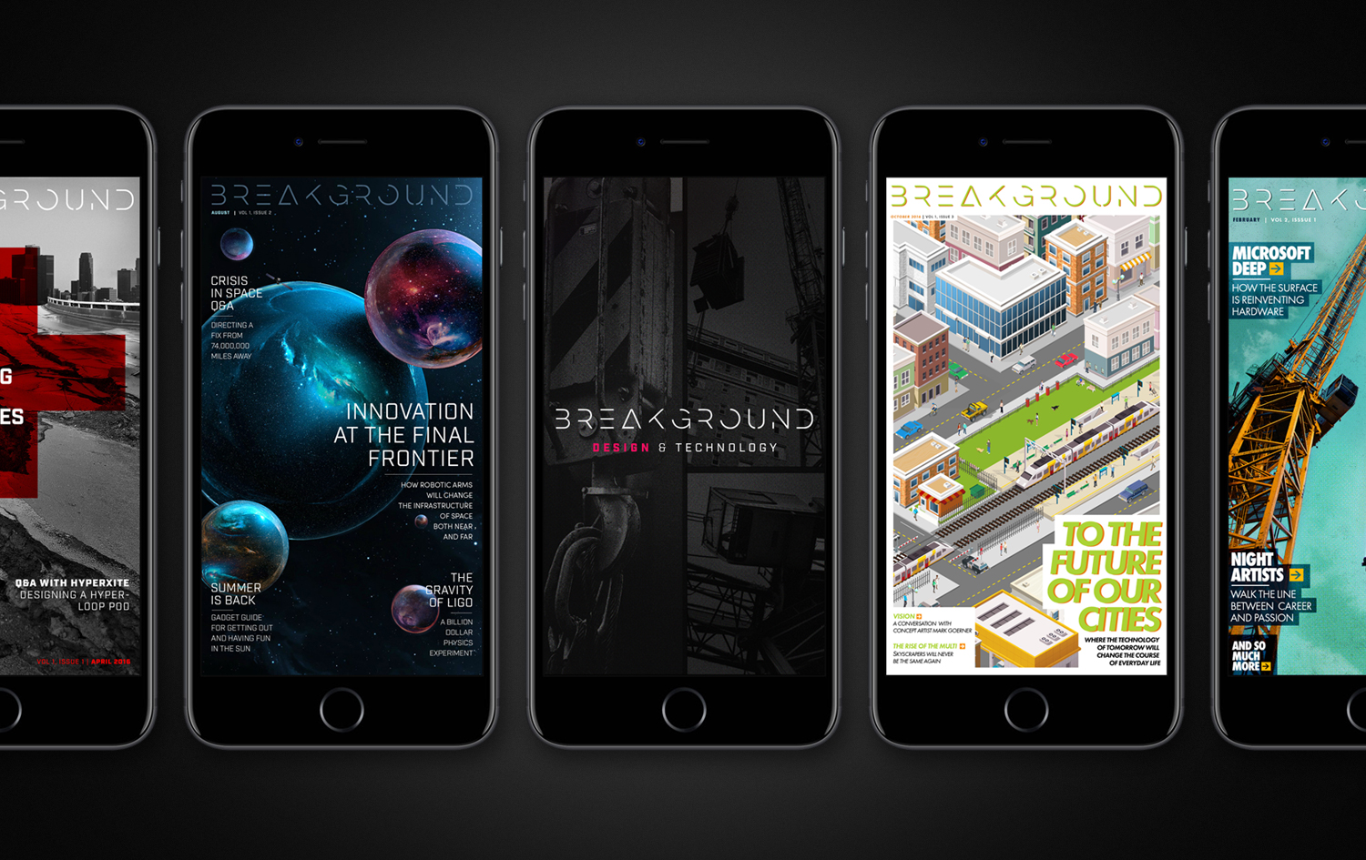
The BREAKGROUND app, a digital publication focused on the AEC industry, was one of the largest and most engrossing projects of my life. For more than a year and a half I worked tirelessly along with David Park to build the entire app from the ground up, including the logo and visual language, the functionality of the app, the conception of the articles in each issue, the photos, illustrations, EVERYTHING. To this day it’s one of the few projects that made me say “I did my best,” and I think the work shows just that!


Brand
We spent about six months fleshing out the brand of BREAKGROUND which included, at one point, several other brand options included different names, logo marks, and different brand aesthetics altogether. Like most stages in the process of creating the brand and the app it was a grueling process. You can see some of the possible brand options below, some of which I still think are solid, but I know we went with the right name and brand.


BREAKGROUND
After dozens of iterations we chose a thinner, more elegant font-based logo that I customized with the goal of setting it apart from the gritty imagery usually associated with the architecture, engineering, and construction industries. The title served as both a directive to innovate and a vow by the magazine to seek out and promote that progress wherever it was found.



Functionality
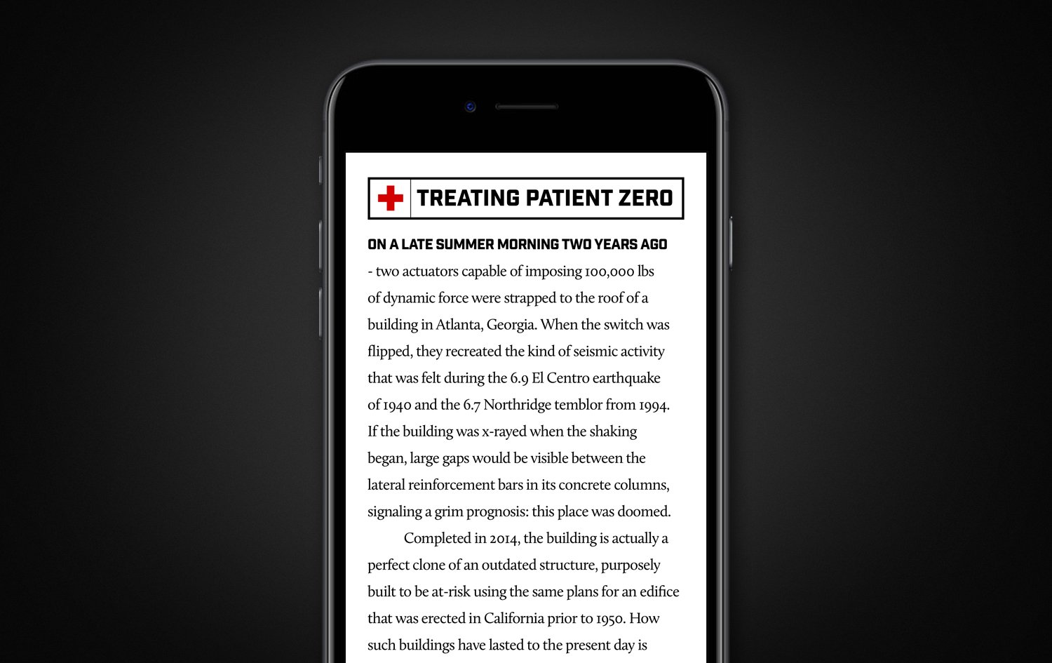
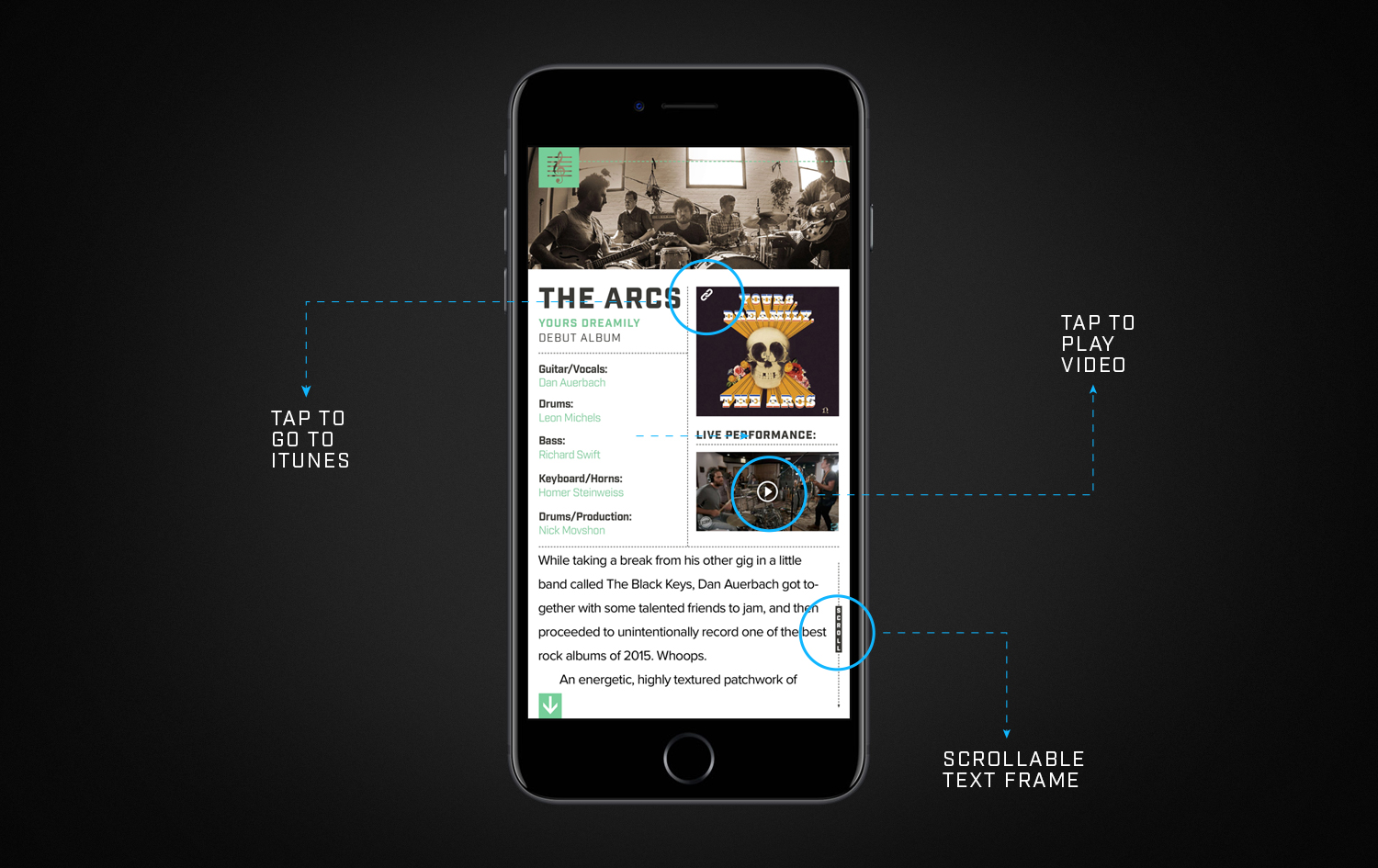
Countless hours (in the thousands) were spent honing the functionality of the app leaving virtually no stone left unturned. David Park and I would talk through functionality and whiteboard specific interactions, then we’d wireframe ad nauseam, then I would personally build/program the functionality across the app (often specific to each article), then we’d have our beta testers try to break something. It was an exhaustive process, but in the end it all paid off, helping us to create an app that gave users a smooth and enjoyable experience.




iPad
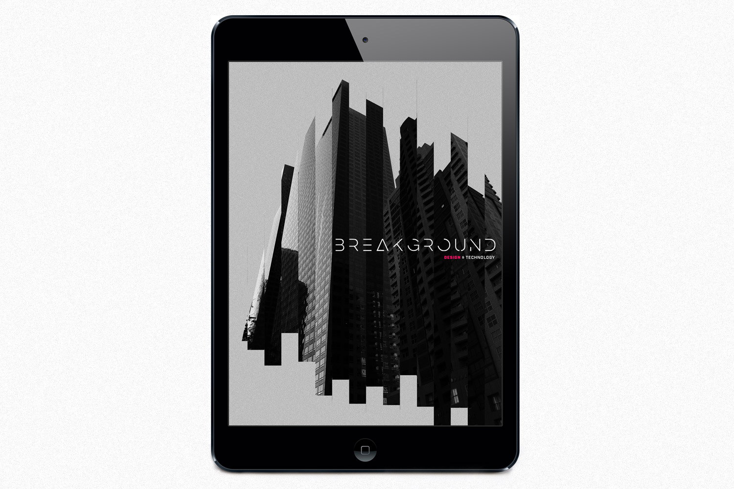
BREAKGROUND began as an exclusively iPad app, but as iPad usage across all applications plummeted and mobile usage skyrocketed, we were forced to focus our attention on the iPhone version, which ended up being the right call in the long run. Still, we are very proud of the iPad version which showcased additional functionality, bigger/brighter images, and overall a larger sandbox to play around and create in.

